.jpg?t=1533315998368) How-To Articles
How-To Articles Support Portal
 Webmail
 Rapid Newsletter+
 eCMS
eCMS
Mobilegeddon has been running full-force since April 23rd, 2015, and CWS team member PJ Calkins has been busy studying its impact on website statistics. It didn’t take long to get the message: mobile responsive websites have done far better than those without mobile optimization.
Never Stop Improving Your Website with Growth-Driven Design. Download the Free eBook
PJ focused on two nearly identical custom manufacturing companies, “Company A” and “Company B.” Company A has only a single landing page that is mobile-friendly (the rest of the pages on the website are not geared for mobile use), while Company B’s site is completely unresponsive to mobile devices. Looking at data from one month before and one month after Mobilegedon, here are some numbers we found:
1) Number of sessions decreased 33%
While the number of sessions for Company A dropped 4.8%, Company B experienced a staggering decline of 33% after Google launched its mobile-friendly initiative. With so many webpages to choose from, it makes sense that people are quick to back out of an unoptimized site in favor of one that is mobile friendly.
2) Non-mobile pages fell 27 slots on Google’s search listing
The average listing drop for Company A was 16. However, for its top 5 internal pages, which aren’t mobile-optimized, this number increases to a 22-slot drop since Mobilegeddon. For a completely unresponsive website, like Company B, the number is even higher at a 27-slot drop for each non-responsive page. People want their sites to be on the first page of Google’s listing (slots 1–10), so this statistic in particular highlights the increasing need for websites to be mobile-optimized.
[Download your FREE copy of An Introduction to Growth-Driven Design!]
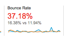
3) Bounce rate increased by 37%
 PJ pulled this graph from Company B’s analytics, and it's easy to pick out the blue peaks, which represent current spiking bounce rates compared to previous numbers (the orange line). Company B’s bounce rate rose 37% and Company A’s rates also increased, but by a lesser 6%. Knowing that the only difference between the two sites is mobile-friendliness, these numbers have huge implications for a company that’s deciding whether or not to optimize its mobility.
4) Mobile traffic dropped by 9%
More and more traffic is rooted in mobile devices. For sites that don’t optimize, they will see their numbers begin to fall, whereas mobile-friendly sites will see an increase in their traffic. Mobile traffic decreased by 9% for Company B, but Company A actually saw a modest increase in traffic by 5% this last month, most likely because they have a mobile-responsive landing page.
5) Total web users has increased 17.6% since Mobilegeddon
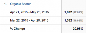 A mobile-optimized site is able to capitalize on that increase, but those who have yet to take the plunge will likely miss out on a whole slew of potential users. The CWS team, for example, has worked to make our own website mobile friendly, and we’ve not only seen positive trends in all these fields (sessions, Google listing, etc.), but PJ points out that we’ve also increased our organic web traffic by 20% since Mobilegeddon.
What you share with the world is important! It may be a bit scary, and it may take a little time to become familiar with mobile optimization, but Mobilegeddon isn’t going away. Mobile-responsiveness is an essential part of increasing your web presence, and we hope that you’ll join us on our journey to embrace it.
Just start your website's mobile upgrade. We can help.

 Our content team is made up of thought leaders, strategists, and content creators who have more than 70 years of combined experience. With a wide variety of backgrounds as entrepreneurs, marketing gurus, healthcare associates, as well as plenty of experience in other industries, we help grow businesses with our relevant, trusted, and helpful resources.